Lately I've found myself hooked on a great graphic pattern--cane.
You've seen it before. In print, it looks kind of criss-crossy, like it wants to be a flag or a symbol or something. It's a great graphic representation of woven cane seating, which is itself pretty timeless. In a stroke of meta-genius or just plain ol' dumb luck, I recently scored a floor pillow covered in a cane-print fabric for $5. That particular client totally got a deal, in addition to the vintage wicker chair I sold her and a vintage rattan accent chair we found together at a thirft store--I'm on a natural furniture spree! (I'll post photos when the place is done.)
Anyhow, I've seen this pattern creep up a lot this summer, in pottery, lamps, and even in printed canvas wallets at Noo Works on Valencia.
Check out a few other cane pieces I've spied:
In the immortal words of Grandmaster Flash and Melle Mel, "And if you get hooked baby, it's nobody else's fault!"
So I found out through my old program director that another grad (this one in fashion) needed some help with a new boutique she, her partners, and their foreign investors were going to open. My previous retail project earlier this year fell flat (and didn't even bother to pay my invoice), so naturally I was wary and didn't respond right away.
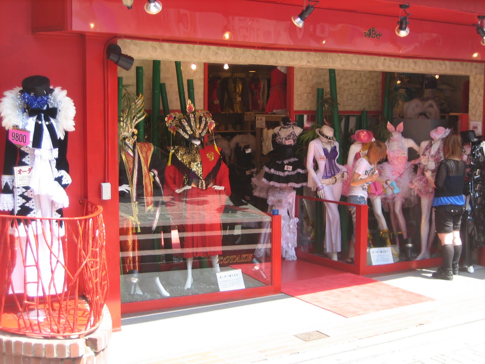
But another request came, so I thought I'd drop this fellow alum an e-mail. Turns out she and her partners were gonig to import Japanese Lolita-style clothing as well as punk-rock inspired Harajuku wear from Japan. When I went to Japan a couple of years ago I loved seeing these extreme styles of clothing being worn regularly by young women--not necessarily just for special occasions. Over a later phone conversation I wondered how these new boutqiue owners would make their imported clothing appeal to mainstream American audiences (especially those who shop around Union Square in downtown SF.)
Here's the look, straight outta Japan:
On the phone they described how they wanted the boutique to look more high-fashion, but that they also needed to stick to the Lolita side's brand. The punk side could apparently have a little more creativity. They were really into checkerboard floors. My first thought was to have the two sides of the store be almost mirror images of each other, hard vs. soft. I thought that vintage/antique pieces could look good on either side: painted white or pastel, they'd definitely look like a Shabby Chic "Lolita"; if spray-painted and distressed, the same (or similar) pieces could definitely look edgier. The trick was to not look like a mash-up of Hello Kitty and Hot Topic. Except maybe in the middle of the shop. That could've been cool...;-)
With less than 24 hours' notice, I was asked to submit a quick sketch. Here's what I came up with:
I wish I could have at least colored it in, or done something digital. But in the end, with a full-time dayjob in design, there's only so much I can do at night after I've made dinner for the family and tried to regain some of my sanity and catch up on correspondence and blog once in a while. (Yes, "dinner for the family" usually means me, my partner, and our cat...but still.)
Never heard back from them, kind of like another project I did where I submitted a series of concepts. (I guess I learned my lesson about spending too much time and energy on pitches with that one.) But I don't know--did I do something wrong, something so bad as to not even receive an acknowledgment of my submission?
I'm still learning the ropes, I guess...
Love, angel, music, baby--hurry up and come and save me!
This last week I was shopping for wallpapers for a client at my dayjob. Since this was for a powder room with no windows, the client really wanted to have a little fun (since working with her, I realized she was completely unafraid of bold patterns and color.) The only criteria? Silver. And patterned.
!!!!!
I thought, This is gonna be so much fun. Going around the Design Center, I pulled dozens of samples from a few pre-selected showrooms. Always keeping my client's tastes and needs in mind, I couldn't help but think which patterns I would choose for my own home if I had a small space to paper. There were so many crazy, fun metallic geometric prints as well as bold florals and toiles on gray and black backgrounds.
Here were some of my favorites:
Of course, coming from the Design Center, these patterns are kind of pricey. While researching other crazy-bold patterns, I went back to one of my favorite designers Barbara Hulanicki (founder of legendary Biba in Britain.) She's since moved on from fashion to interiors and designed pieces for Habitat in Britain as well as wallpapers for Graham & Brown available here in the US.
Here are a couple of my favorites:
Y'know what's even better than being to find her wallpapers in the US? You can get some of them at Target.
!!!!!
Looks like Ms. Hulanicki's kept one thing from her Biba days: affordable design. Love it!
This last weekend I had the chance to finish up with L., one of my Oakland clients who found me through the magic of the internet. When we began back in April, we were faced with an interesting problem: having just moved back to the Bay Area for work, L. decided to start over from scratch. She had just a few pieces of art that she loved, and virtually no furniture. Just a bed and dresser, two kitchen chairs, a bookcase, an ottoman, and a TV and stand.
The great thing was that she was realistic about what she wanted to spend for decent quality furniture, and she wanted a mix of pieces that could grow with her. After a good consultation and some e-mail correspondence we came up with a concept for her recently renovated 60s-era apartment:
L.'s tastes leaned toward midcentury anyway, so we found pieces that complemented the architecture of her apartment as well as her sensibilities. The two "midcentury modest" chairs I scored from a thrift shop were a nice counterpoint to the more streamlined pieces I had her purchase. The living room side table was free--how can you beat that!? The zig zag rug was something we had to talk about for a bit--at first she wasn't sure what to make of it--but it soon became one of her favorite pieces in the room (I think she had one of my "I'm about to lose control and I think I like it" moments!)
As most of us know, all roads lead to Ikea when you're starting out on your own, so bedroom chairs, curtains, nightstands, and several other pieces came from our favorite Swedish retailer. Sure, she's got a few little things left to do, like hang that dining room pendant she bought and maybe get a plant and some more accessories and art, but in the end, we got her set up with a good mix of quality and vintage pieces--the perfect foundation from which to grow.
Here's the living room before:
And after:
The dining room before:
And after:
The bedroom before:
And after:
I look forward to getting updates from L. in the future, and can't wait to see how her apartment evolves!
I'm a major proponent of having a varied mix of art in the home. In some cases I think it really comes down to a good balance of bold graphics and original pieces. Maybe it's the graphic designer in me, but I always gravitate towards interesting posters. But then I have to mix them up with paintings and other abstract patterns. Accident and Artifact and the Lost Art Salon are two of my favorite places to find original art, while the Renegade Craft Fair recently brought Seattle Show Posters and the Poster List back to town for a weekend. (I picked up a couple of great typography-based prints!)
The best part about original art--particularly sketches--is how much they seem to convey a snapshot in time. I think they're like photographs, but done by hand. They have an immediacy and looseness that captures a particular moment in time. Even when they're presented as gifts or purchased somewhere, you'll always attach a memory to it. I'll never forget seeing a collection of Don Barchardy's drawings in London years ago. They were all the same size (24 x 36 ish), and there were dozens of them. You could imagine them being presented to their famous sitters/subjects after Don was done.
One of my own prized possessions is a little midcentury sketch that was given to me as a wedding gift. It hangs in my bedroom and I always think about how/when it was created and the people involved.
I've sold my own sketches to clients before (they're a good 15 years old, which kind of makes them vintage ;) and I also recently gave two away as gifts. It felt good to give something that I had made myself:
So go out there and make your own art, or find something similar. I think organic pieces with high contrast can really balance out all the photos, posters, and other art in your space. If nothing else, you'll have a great story to tell your friends and visitors.
My client base is pretty diverse, running the gamut from singletons to young families to a set of grandparents. But last week I finished a project that turned out to be a Retrograde first: a nursery for a baby boy.
The deadline got moved up because, well, we wanted to finish before the baby was born. (In fact, he's due any day now!) My client and her husband had just renovated their basement into a kicka** master suite and wanted to turn their old bedroom into the nursery for their son. (Yes, they knew ahead of time that they were getting a boy ;-)
What made these clients interesting was how in tune they were with my own style. The mom-to-be frequents the same thrift stores and antique shops around the Mission as religiously as I do. They shared my attitude about reusing and upcycling materials, turning them into great custom pieces. Needless to say, this made my work really easy, since the mom-to-be had done so much work already. I felt like I came to this project as a consultant or sounding board, giving her another opinion or verifying the great decisions she had already made.
Taking the fabrics and pieces she had already acquired, I worked up a treatment for the nursery, including some different floor plans:
In the end, some of the placement of furniture changed for the better (or the more practical.) She also decided against using her vintage Saarinen tulip side table in the nursery (wise decision--this will turn into a rambunctious toddler's room soon enough!) She also enlisted the help of her incredibly skilled mother to make custom pillows, a daybed cover, and to paint the vintage dresser into a great changing table.
I wish all my clients had mothers like that!
I brought over a few finishing pieces (including the homemade Keith Haring "Night Owl" nightlight, which I gave them as a gift) and took some photos.
Here are the before-and-afters showing the transformation from master bedroom to nursery:
(Before - with fabrics and crib tucked in a corner)
(After - a daybed for lounging or nursing)
Yes, there's a lot of blue in there, but I was really glad to see my client wasn't afraid of getting other colors in there too, like orange and green. With the daybed and vintage dresser in place, it could easily be turned into a guest room or a sitting room if the baby ends up in another part of the house.
I'm just glad I got to take a few pictures before the little guy's arrival! Here's a little video dedicated to him and his awesome family:
So my Facebook peeps are usually kept up to date on everything that happens on this blog, but I realized that the flow of information doesn't go both ways (is "non-vice-versa" a term?)
A few weeks ago on Facebook I posted a link to this great article where I was interviewed by IIDA, the International Interior Design Association. It's all about the power to reinvent oneself and they interviewed several people who had entered the field of interior design after having had other careers (I was in graphics for nearly 10 years. I was also--and still consider myself to be, occasionally, an actor, too.) It felt good to get some exposure and talk about my new day job in interior design.
Then, on Monday, one of the contributors to Apartment Therapy contacted me and asked if he could have permission to feature some of my before-and-after Retrograde projects on their site. I nearly flipped out--one of my favorite websites (and one of my big inspirations to go back to school for interior design) was contacting me.
Of course I said "yes!" Check it out--it ran on Tuesday (talk about fast turnaround!)




 (Before - with fabrics and crib tucked in a corner)
 (After - a daybed for lounging or nursing)


