All original work © Jason W. Wong. Please ask for permission to reproduce any work.

All original work © Jason W. Wong. Please ask for permission to reproduce any work.

Friday, April 30, 2010

In the white room with black curtains near the station...

A couple of weeks ago I blogged about how my partner and I painted our front room a dark cool gray...and how much we love the transformation.

Well the painting, it didn't stop with my office!

Last weekend we rallied and busted out the rollers and trays again to paint our main living room white. Now I know what some people might be thinking--"White's so boring! Why not choose an exciting color!" Well, this room is in the middle of our flat and gets no direct sunlight. Even in its original buttery yellow, it could seem like a dungeon. And the semi-gloss finish of the white paint we used reflects light throughout the day, making the whole flat seem brighter.

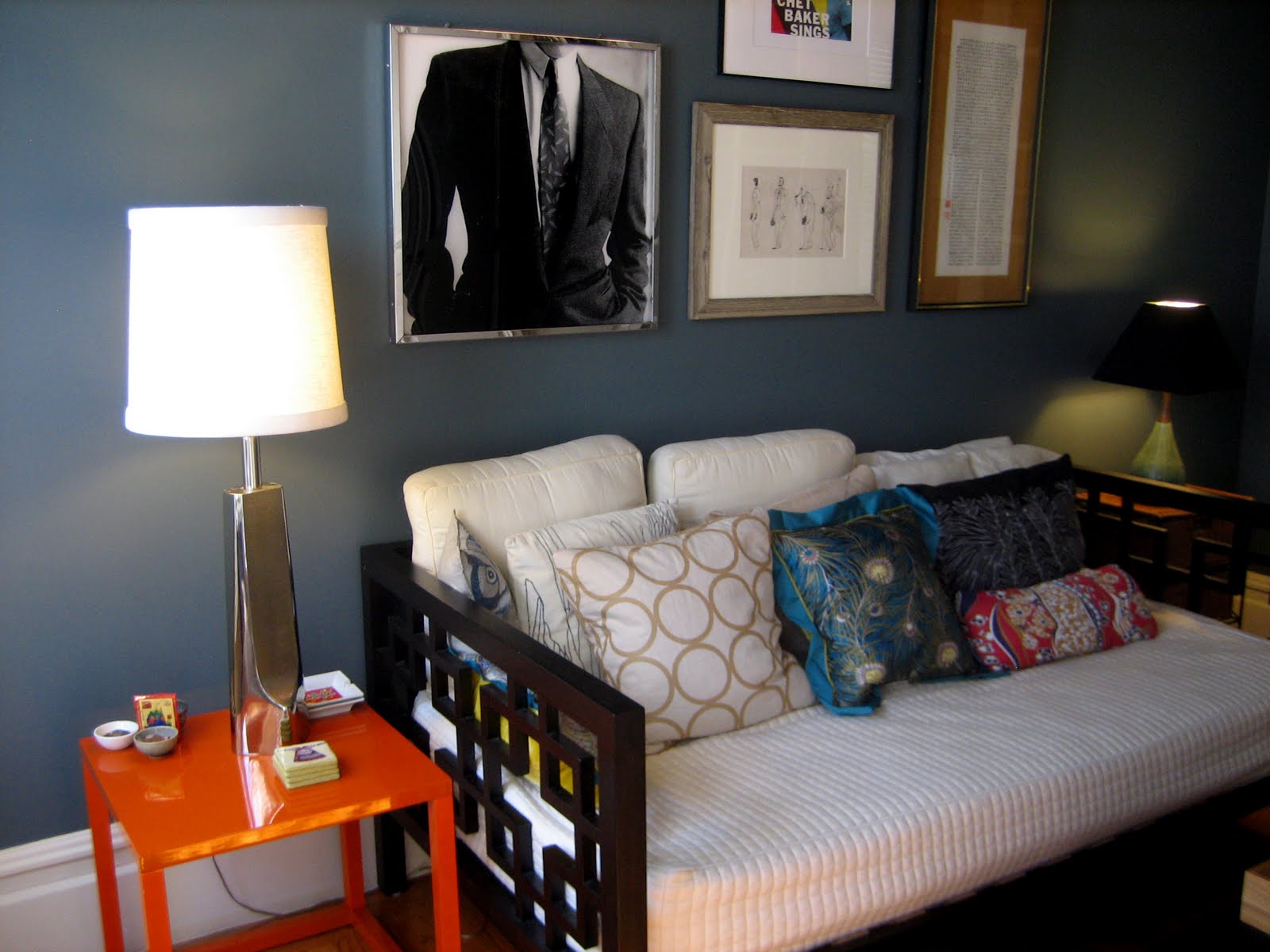
Contrary to popular belief (which probably comes from people like me, who were scarred by growing up with sterile white walls in a suburb somewhere) white can be incredibly dramatic. Like the dark gray of my office, colors and accessories can really stand out against a white background.

Trust me. I went through a period where I rebelled from my white-walled childhood upbringing and simply had to paint every room of my home(s) a different color. Sometimes I think that's what your 20s are for. Now I'm over it. And after living with the buttery yellow for four years, I was ready for a change. (Please don't peg me as a color hater--remember that I prescribed a lemony yellow and a bright green for Amy & Akhil--it's just that the gray and white better reflect my and my partner's tastes.)

Here are some before (yellow) and after (white) photos:


And of course, we got new bookshelves:


Some may call it the look a bit sparse, but after years of "artful clutter" I figured it was good to edit. Regardless of what you might think of this particular look (I know some folks will prefer the warmth of the "before" shots), it's always a good idea to shake things up every so often.

Wednesday, April 21, 2010

But if I work all day at the Blue Sky Mine, there'll be food on the table tonight...

It's funny how these things happen. A few weeks ago I blogged about how I felt alone and isolated in my work, like some desert island shipwreck survivor. Well, last week I started week at a very high-profile interior design firm.

What?

That's right. Now I'm basically working full-time to assist one of the principal designers and am learning so much about the industry and client relations it's mind-boggling. I'm okay with performing some administrative tasks I haven't done in nearly 15 years (I've been channeling Ugly Betty) because I'm picking up on things that one can never learn in a classroom: contract negotiations, change orders, construction disputes, and, most importantly, finessing clients. The steady paycheck is kind of nice, too.

Luckily I'm no spring chicken, and have been bringing my experienced and knowledgeable inner Betty Suarez to the workplace (and I mean the pragmatic, organized, and upbeat side of Betty--I don't wear ponchos. And my glasses are D&G, thankyouverymuch.) I also negotiated time to continue working with my own clients, so if you're out there reading this, you have nothing to fear. If anything, this new job will make our projects together even better and more professionally executed.

In fact, I developed a new one-sheet that a contact is handing out to prospective clients. It was nice to have a companion piece to my graphic design/communications one-sheet, summarizing the kind of work I can do as Retrograde. I hope in the future I can recruit some of the good people in the Colleagues sidebar to help with my projects.

To quote from one of my favorite episodes of Star Trek: The Next Generation, "When the train comes in, everybody rides!"

Saturday, April 10, 2010

There's nothing I can see but possibilities...

As I wrote before, I enjoy traveling around the region searching for interesting pieces for my projects. For one of my Oakland clients (I now have two) I found a pair of vintage nightstands in excellent condition. Even though I liked them as they were, all natural wood and veneer, I thought they might look even better painted in a Hollywood Regency style for this woman's newly refurbished loft.

After two coats of glossy black and white paint (I left a small band of trim untouched for a warm contrast) you get these shiny gems:


Wow. What a difference, eh? Now I need to find some lamps to go on top...

Wednesday, April 7, 2010

Home, you are me and I am you...

The homes of designers and other creative folks can go either way--sometimes they're magazine-quality showstoppers and sometimes they're totally neglected messes that remind you of that old saying, "the cobbler's children have no shoes." Well I like to think of my home as a laboratory. (And a warehouse, but that's a different story.) Former FIDM instructor Grant Gibson gave a guest lecture last year and told us future designers that our homes had better look good--after all, they're a reflection of our styles and capabilities. His faculty successor Ashley Roi Jenkins added that she often used her own home to experiment and create vignettes as well.

I decided it was finally time to start practicing what I preached. You see, for the past year or so I've been going on and on about my love of dark gray/black rooms. (And bright white rooms, too.) They're crisp, sophisticated, and incredibly versatile backdrops for all sorts of furniture and artwork. But more often than not, people need to see real examples. So for the sake of my clients, all of you readers out there, and my own sanity, I painted my front room (also my office) a cool dark gray.

For nearly four years, it's been this soft, buttery yellow--kind of the go-to color for folks who want walls to be neutral without being beige. When Jim and I first moved in, I took one look at the coved ceilings and said out loud, This is good enough. I wasn't going to touch those 10-foot ceilings. Plus, I was kind of burned out on painting, having done extensive work on my last three apartments. (I think I was working through that living-on-my-own rebellion, painting every room a different color just because I could. A lot of people seem to go through that, the result of growing up with plain white walls I'm sure.)

But four years of living with the buttery yellow had finally taken its toll. It felt soft. Too soft and safe for us and our tastes. We've got lots of bold, interesting artwork that just didn't have as much impact against the yellow walls, and were therefore banished to storage. The front room where I work faces East and gets flooded with morning light, so I knew it could handle the gray. On Sunday Jim and I dove in and covered the walls with Pittsburgh Paint's "Canon Gray" (I did the ceiling on Monday morning.) Now the walls feature new art from our collection, and I'm free to search for brighter pillows in saturated colors for the daybed. Almost all colors seem to go well with the gray, and it's still light enough so our dark furniture stands out. Jim calls it "regal." I agree.

Here are before and after photos:


I love it. I'm more of an advocate than ever before.

And now that I've finally painted again, I can safely advise my clients to hire someone else to do the work for them. Seriously, coved ceilings were a pain in the a** to paint! But at least I now also have firsthand experience working with no-VOC paint and can wholeheartedly recommend it. At one point while we were painting, I turned to Jim and said, Take a whiff. Smell anything?

"No, nothing" he replied.

Exactly. No fumes!

So get out there and embrace the dark side.

(More posts soon with my new all-white living room.)