
I decided it was finally time to start practicing what I preached. You see, for the past year or so I've been going on and on about my love of dark gray/black rooms. (And bright white rooms, too.) They're crisp, sophisticated, and incredibly versatile backdrops for all sorts of furniture and artwork. But more often than not, people need to see real examples. So for the sake of my clients, all of you readers out there, and my own sanity, I painted my front room (also my office) a cool dark gray.
For nearly four years, it's been this soft, buttery yellow--kind of the go-to color for folks who want walls to be neutral without being beige. When Jim and I first moved in, I took one look at the coved ceilings and said out loud, This is good enough. I wasn't going to touch those 10-foot ceilings. Plus, I was kind of burned out on painting, having done extensive work on my last three apartments. (I think I was working through that living-on-my-own rebellion, painting every room a different color just because I could. A lot of people seem to go through that, the result of growing up with plain white walls I'm sure.)
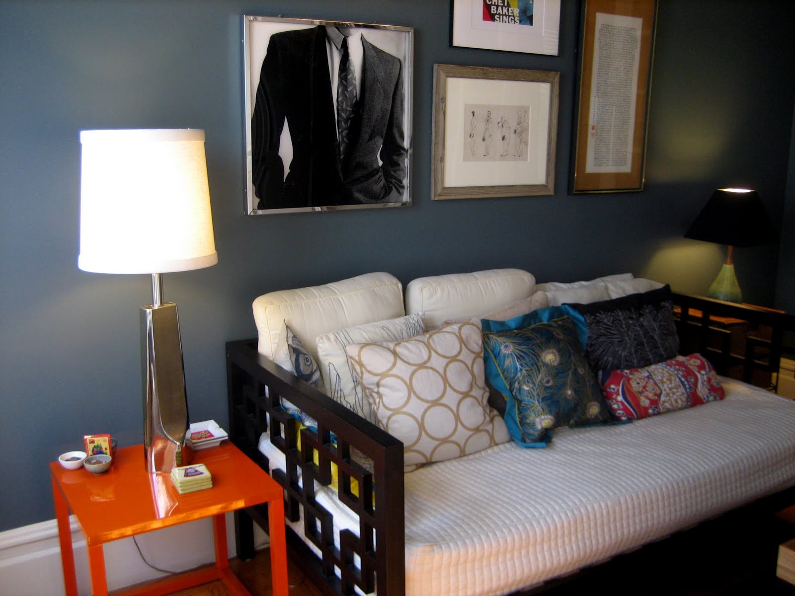
But four years of living with the buttery yellow had finally taken its toll. It felt soft. Too soft and safe for us and our tastes. We've got lots of bold, interesting artwork that just didn't have as much impact against the yellow walls, and were therefore banished to storage. The front room where I work faces East and gets flooded with morning light, so I knew it could handle the gray. On Sunday Jim and I dove in and covered the walls with Pittsburgh Paint's "Canon Gray" (I did the ceiling on Monday morning.) Now the walls feature new art from our collection, and I'm free to search for brighter pillows in saturated colors for the daybed. Almost all colors seem to go well with the gray, and it's still light enough so our dark furniture stands out. Jim calls it "regal." I agree.
Here are before and after photos:


I love it. I'm more of an advocate than ever before.
And now that I've finally painted again, I can safely advise my clients to hire someone else to do the work for them. Seriously, coved ceilings were a pain in the a** to paint! But at least I now also have firsthand experience working with no-VOC paint and can wholeheartedly recommend it. At one point while we were painting, I turned to Jim and said, Take a whiff. Smell anything?
"No, nothing" he replied.
Exactly. No fumes!
So get out there and embrace the dark side.
(More posts soon with my new all-white living room.)
4 comments:
I LOVE IT!!! It really does make the colors pop. The orange side table did it for me. Well done!!!
I also love it, and now I want new couches again.
love LOVE love the grey. Grey is my favorite color (for walls right now) and this shows how well it can be executed - well done!
Jason! It looks absolutely fantastic, very handsome. I used a similar color for the interior of my built-ins & recently painted one wall of my room in a "chalky" french gray. I agree, it is fun to embrace the dark side. Dont worry though, I'll stick to my (our) predominantly neutral roots. Haha.
Post a Comment