Here's a little preview of a project I've been wrapping up through Homepolish in the East Bay community of Piedmont. It's taken nearly a year since we first began, but it's been worth it--I helped the owners during the gutting and remodeling of this Tudor-style house, selecting floor finishes, tiles, fixtures, and more. And then after they moved in, helping arrange art, reupholstering some antique furniture, and getting new pieces to suit their lifestyle and the new house.
It's been a labor of love and I'm going to miss these clients--amazingly nice and always encouraging me to move to the East Bay ;-)
All original work © Jason W. Wong. Please ask for permission to reproduce any work.
All original work © Jason W. Wong. Please ask for permission to reproduce any work.
Sunday, December 21, 2014
Sunday, December 14, 2014
It's just a Reflektor...
Hopefully you've noticed the new and improved website for my regular biz recently. One handy feature of the Wix site is being able to link this blog. So now you can access it here from Blogger or from my website.
I kind of imagine having them create some kind of feedback loop where you see endless reflections of the screen...but then again I'm kind of crazy that way ;-)
I kind of imagine having them create some kind of feedback loop where you see endless reflections of the screen...but then again I'm kind of crazy that way ;-)
Sunday, November 30, 2014
She's still preoccupied with 1985...
It's time for a big before-and-after that I've wanted to share for a while, but I was just waiting to have it professionally photographed first (thanks to the multi-talented Lauren Anderson who I met on a Homepolish project.)
My client inherited a condo from his parents that was used as a pied-a-terre for many years. Professionally decorated before, it hadn't changed since everything was originally installed. I was shocked at how well things were maintained--the wallpaper, the fixtures, the mirrors...everything was still in great condition with the exception of some carpet fading at the windows and sliding glass doors.
Funny enough, when I showed some "before" photos to some female friends, they actually all loved the "befores" (a testament to the original designer and the clients' tastes.) But when they found out my new client was a young, single man, their reaction changed instantly: "Oh no. You've got to change it. This isn't for a single guy at all."
So we butched it up. Here the Living Room before:


And the Entry after:
Bathroom before (salmon wallpaper) and after (deep blue):
The Bedroom before:

Quite a change, eh? The thing my client couldn't get over was how so many things that his parents had picked before had come back in fashion: the chrome, the lighting, the mirrors, the plexiglass. It was a great savings, being able to simply reupholster a few things and reuse as much as possible. The organic wavy entry wallpaper (I think it's real Maya Romanoff) was our starting point and inspired me to find taupes and browns that could really feel masculine and warm. Keeping everything else calm and neutral (including black and white photography and a now-vintage Edward Fields rug) allows the few accessories (green pillows, a bold Navajo rug) to really pop.
This was one of the most fun projects ever!
My client inherited a condo from his parents that was used as a pied-a-terre for many years. Professionally decorated before, it hadn't changed since everything was originally installed. I was shocked at how well things were maintained--the wallpaper, the fixtures, the mirrors...everything was still in great condition with the exception of some carpet fading at the windows and sliding glass doors.
Funny enough, when I showed some "before" photos to some female friends, they actually all loved the "befores" (a testament to the original designer and the clients' tastes.) But when they found out my new client was a young, single man, their reaction changed instantly: "Oh no. You've got to change it. This isn't for a single guy at all."
So we butched it up. Here the Living Room before:


And the Living Room after:


The Entry before:

And the Entry after:
Dining alcove before (pink) and after (green):
Bathroom before (salmon wallpaper) and after (deep blue):
The Bedroom before:

And the Bedroom after:
Quite a change, eh? The thing my client couldn't get over was how so many things that his parents had picked before had come back in fashion: the chrome, the lighting, the mirrors, the plexiglass. It was a great savings, being able to simply reupholster a few things and reuse as much as possible. The organic wavy entry wallpaper (I think it's real Maya Romanoff) was our starting point and inspired me to find taupes and browns that could really feel masculine and warm. Keeping everything else calm and neutral (including black and white photography and a now-vintage Edward Fields rug) allows the few accessories (green pillows, a bold Navajo rug) to really pop.
This was one of the most fun projects ever!
Monday, November 10, 2014
French Kissing in the USA
Between work, other artistic endeavors, and trying to not work on Sundays (boundaries, people! Boundaries!) it's been hard keeping on the ol' blog. But at least I've had this topic in my editorial queue for a while.
When I was in London this past May, I saw these great chairs in a restaurant. I knew they were by some design icon, but I had forgotten who had originally designed them.


I love the stool version and wish I could get a pair of counter stools. Sigh...someday!
When I was in London this past May, I saw these great chairs in a restaurant. I knew they were by some design icon, but I had forgotten who had originally designed them.


Now I know--they're the Les Arc chairs by Charlotte Perriand, a contemporary/colleague of Le Corbusier. Of course the restaurant chairs were probably a reproduction. There are affordable copies in many places, and I've even seen denim versions at Big Daddy Antiques in San Francisco. As you can see, the real deal (vintage, no less) can be pricey:
I love the stool version and wish I could get a pair of counter stools. Sigh...someday!
Sunday, October 19, 2014
Our house is a very very very fine house
I just picked up this book at my local bookshop a couple of weeks ago and can't wait to read it. It's in defense of all of us who have "stuff"--call us maximalists, eccentrics, messy, but don't call us hoarders (that's something else totally different!)

Can't wait to read it. Afraid of adding another book to your own cluttered collection? Borrow it from your local library!

Some of the images do border on hoarding, but I like how it takes into account a different aesthetic, one that is more forgiving for those of us with collections, children, animals, too much art, or all of the above.
And of course, the tagline on the back of the book is my new motto ;-)
Can't wait to read it. Afraid of adding another book to your own cluttered collection? Borrow it from your local library!
Sunday, September 28, 2014
Where the clouds are made of candy floss...
Yeah, it's been a while. When I'm not working on the next theater piece (and its costumes--a new creative challenge!) I've been training for my marathon. Oh yeah, and I'm still working too! So blogging can be kind of tough. I just saved a NY Times article about how a blog can become a slog and kind of dread reading it.
A couple of months ago I was in Ikea, researching some things for a client and saw really cute, bright, totally unrelated items in the current collection that surprised me. Very European, very graphic, very cool. I could see any of these trays or rugs brightening up someone else's home or a kid's room.
Is summer technically over? I hope not. With some of these pieces, you could keep autumn and winter bright and fresh!
Sunday, September 7, 2014
Already Home
Even though I spent nearly three weeks in Poland (my second trip there this year) I only had three days off from my acting./movement/vocal workshop in the woods. So I'd venture in Wroclaw, the third largest city in Poland (I believe) and take in the local sights. Here are some things I noticed:
Great hand-printed wallcovering (or stenciling) at popular hostel Mleczarnia:


A lovely shade of green:


Great hand-printed wallcovering (or stenciling) at popular hostel Mleczarnia:


Awesome seahorse and mermaid chairs at the National Museum:


A detailed metal door in the City Hall:

A plaque outside the offices of Grotowski Institute, our local host:

Milk crate lights in a vegan cafe!


A lovely shade of green:

Someone not afraid of being an individual:
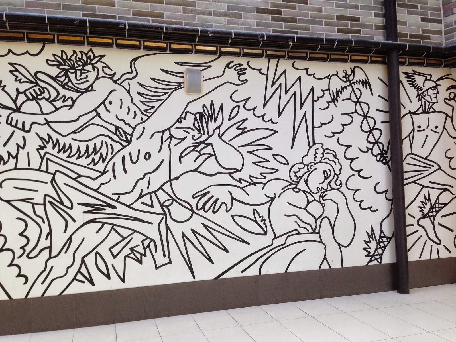
Awesome architecture and public art murals in a prewar department store/shopping center (Renoma):

Lady Liberty's Polish cousin on top of this old bank building..?

And Wroclaw's answer to London's ICA--the Contemporary Museum

And here was my home base for two-plus weeks. I made my bed and room feel as homey as I could!
Subscribe to:
Comments (Atom)


